
Less is More

Hello everyone, welcome back! For the most part my blog has been centered around album covers that could be considered highly decorative or design oriented. However, this week I want to talk about the power of simplicity with album art. The phrase “less is more” is used to express the view that a minimalist approach to artistic or aesthetic matters is more effective. So what does minimalist album art look like? Let’s take a look.
All album art starts off as blank canvas and I think there is something to be said about choosing to leave a cover empty. We can compare this to fine art pieces such as Robert Rauchenberg’s Three Pannel White Painting or the works of color-field painter, Mark Rothko. In fact Rothko is quoted with saying, “there is more power in telling little than in telling all.” Emphasis on the less is more mindset. The absence of substance let’s the viewer be enveloped in the work. The same thing can be applied to album art.
Some of the most iconic album covers Kendrick Lamar, Beach House, Beach Fossils Beatles White Album. Using a solid cover on a cover These solid covered album covers portray the mood of the album with a solid color or no color at all.


Californian artist Rutherford Chang displayed his staggering collection of 693 discrete second hand copies of The Beatles’ self-titled 1968 LP, more commonly known as The White Album, at New York’s Recess Gallery.
As Chang told the New York Times in February of this year: “Being an all-white cover, the changes are apparent. The serial numbers made collecting them seem natural, and the more I got, the more interesting it became. As you see, many of them are written on, and each has a story. The accumulation of the stories is part of it.”


Citations:
https://thevinylfactory.com/news/artist-layers-100-unique-copies-of-the-beatles-white-album-for-original-vinyl-release/

ART as Album Art
Welcome back everyone! I made a playlist that coincides with this post so you can listen to it here while you read. (Only on Spotify, sorry Apple Music users!)
Before I begin I feel that it is crucial to I share some insight on how I decide who I'm writing about each week. Ever since I started this blog I have amassed a pretty expansive list of specific album artists or covers that I want to do a deep dive on. Whenever I discover a new album cover or think about an old cover that I like, I do some research to help me learn out more about the artist who made it. This list has become my holy grail, go-to guide and reference point for this blog and in my own practice as a designer. It has also helped me understand that there are different archetypes of album artists with varying purpose and intent.
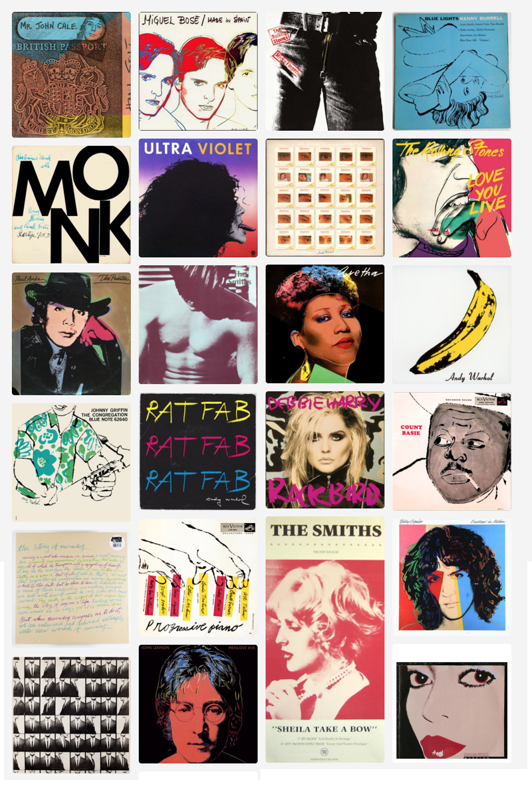
Throughout the past few weeks I have been listening to The Velvet Underground & Nico album on replay. One of my all time favorite albums with the iconic banana cover created by legendary artist, Andy Warhol. (Cover is shown to the right: fourth row, last column) And that's when it came to me. There is this entire niche of famous fine artists who have intersected themselves into music through album art.
Take Andy Warhol. Unless you live under a rock you have most definitely seen the works of Warhol. He is considered to be one of the founders of the Pop Art Movement. His most celebrated works are his technicolor screen prints of celebrity portraits or soup cans. What you may not know about Warhol is his involvement in the music industry. Not only did he manage the Velvet Underground for their first studio album, he also directed the Cars Hello Again music video and was heavily associated with the Studio 54 scene. Studio 54 was an exclusive nightclub in the late 70’s known for its celebrity infested atmosphere and housing disco at its peak. Andy Warhol’s genius on top of his music industry connects illustrates how he was able to develop so many album covers in his lifetime. Warhol has designed covers for acclaimed musicians such as The Rolling Stones, Aretha Franklin, Diana Ross and John Lennon. To the right is a collection of some of his most notable album art.
Warhol isn’t the only one. When I went back through my list I noticed that at least half of the names I had written down were famous artists. Even George condo who I covered in a previous post. In the slides below, I am going to showcase some album art that was made by other prominent artists.


Jean-Michel Basquiat The New Abnormal by the Strokes.


Robert Rauschenberg Speaking in Tongues by the Talking Heads.


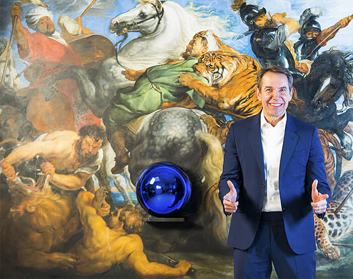

Jeff Koons ARTPOP by Lady Gaga.


Takashi Murakami Graduation by Kanye West.


Keith Haring Without You by David Bowie.

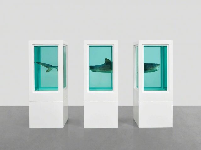


Damien Hirst I’m With You by the Red Hot Chili Peppers.


Robert Mapplethorpe Horses by Patti Smith.


Gerhard Richter Daydream Nation by Sonic Youth.


Salvador Dali Lonesome Echo by Jackie Gleason.


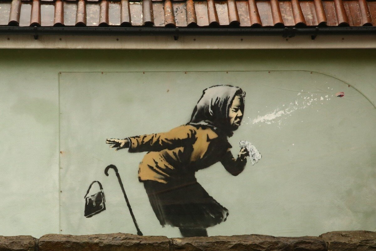

Banksy Think Tank by Blur.
I think there is something to be said about how layered the intersection between art and music is. Here are some open ended questions that don’t necessarily need to be answered, but I’d love to hear what other people think about this. Does how famous an artist is effect the general perception of an album cover? or even of the song? Is an album cover art or design? Is all album art art?
Citations
https://www.billboard.com/articles/news/pride/8214697/andy-warhol-music-influence-rupauls-drag-race
https://news.artnet.com/art-world/the-top-12-album-covers-designed-by-famous-artists-12696

Covering My Design Journey
Hello my fellow album art lovers! Welcome back to my blog. This week I want to switch things up a little and showcase my own album art for you guys and talk about my process. A huge part of the reason why I’m so passionate about all things album art is because it’s what I do. I feel eternally grateful that I’m able to mesh my two passions together.
Music is a big part of my life (as it is for most people). I would even say it is my love language. I grew up getting dragged to concerts and music festivals by my parents on the regular. I would sit at these shows and watch all the visual elements from the screen behind the musician playing trippy visuals to the merch-stand with all of the artists merchandise and posters. Through this I have developed an intense admiration for the music industry and all of it’s walking parts.
When I started dabbling in graphic design, I knew that I wanted to work with musicians to help visualize their artist identity through design. I also knew that musicians weren’t just going to fall into my lap. If I wanted to design covers I had to reach out to musicians first. I am a firm believer in the Law of Attraction. If you don’t know what the Law of Attraction is it is a “pseudoscience based on the belief that positive or negative thoughts bring positive or negative experiences into a person's life.” Changing my mindset was super beneficial to help me get to where I am now. Not only did I start making work to showcase to future artists I work with, but I also spent a majority of my time reaching out to musicians. My days now basically consist of me looking at album art and then making my own.
Each project holds a special place in my heart and shows me my growth as a designer.


On: George Condo
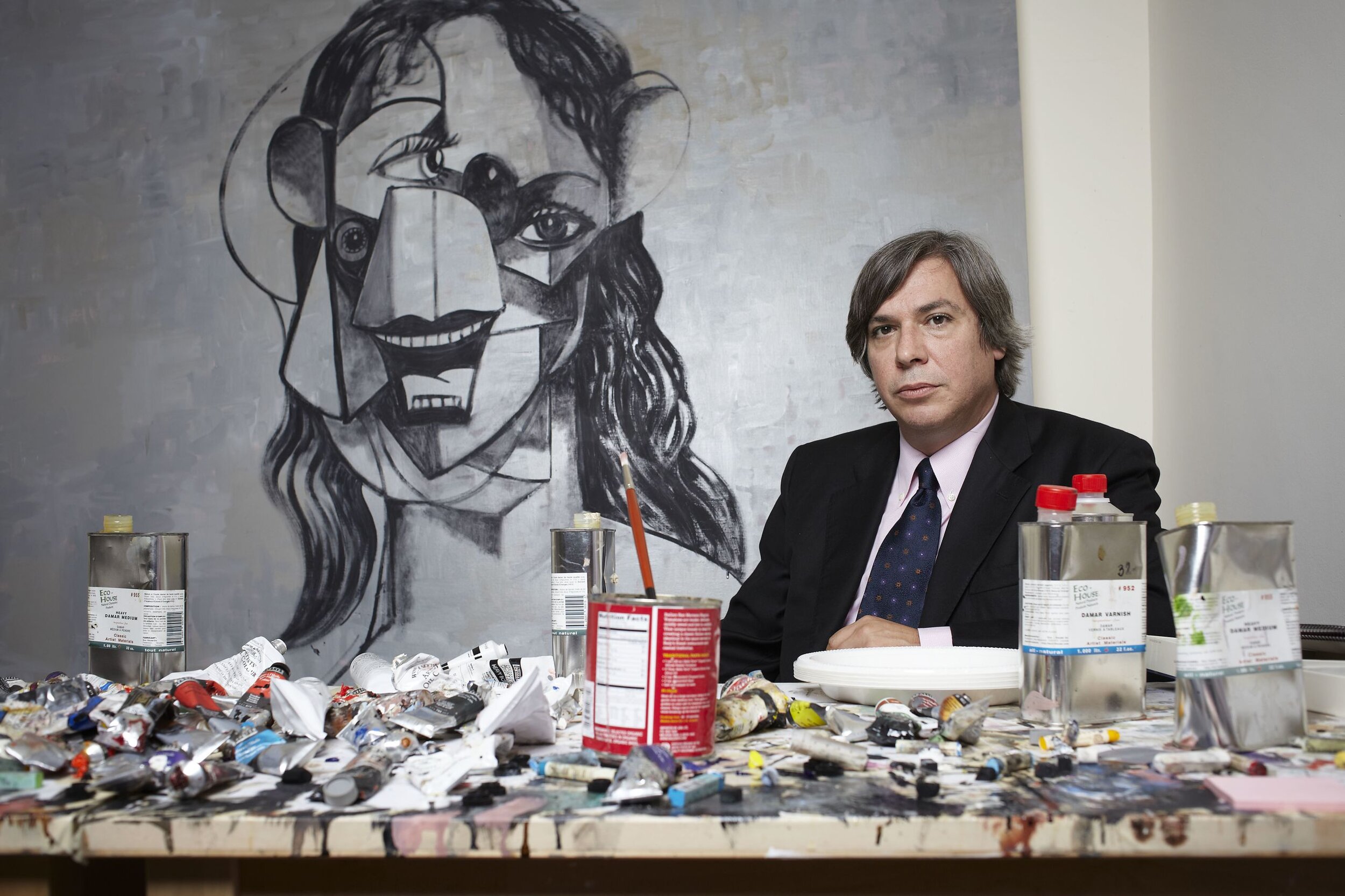
Hi everyone welcome back to my blog! This week I’m going to dive into the works of George Condo and discuss why album art is. If there are any hype beast, Yeezy-lovers reading this settle down. This piece is for you.
George Condo is a visionary artist who has made a huge impact in the contemporary art world through his paintings, drawings, sculptures and prints. His background stems from his love of both music theory and art history. Throughout his early career Condo danced between the two paths; starting off working at a silk screen shop while also being the bassist of the band The Girls. In the late 80s, he even opened for Jean-Michel Basquiats band, Gray. After this connection, Condo decided to move to the infamous Ludlow Street in NYC where he began his career as a practicing artist. Condo also later became a founding member of the bluesy punk band Hi Sheriffs of Blue. His early works were seen alongside artists like Basquiat and Keith Haring who were all linked to the East Village art scene during that time.

Condo has had a lasting impact on the music industry as well. If you google his name and look at his works you may recognize the style of his paintings. In 2010, Kanye West released his album My Beautiful Dark Twisted Fantasy. Condo made a series of covers for him. Kanye even played at one of his gallery openings.
Beyond collaborating with Kanye West, Condo has also created covers for other iconic artists such as Phish and Travis Scot. Below you can see Travis Scott with Condo himself and then the cover he did for him. Condos work is a reminder that. I hope you enjoyed reading about George Condo and check out his works on your own time. See you next Sunday!


“If the soul and the ego were objects we could look at, the soul would be a translucent heart beating. If you broke away the tissues, you’d destroy a very delicate pulse. And the ego would be an armored unit designed to protect the soul. The soul is in need of protection from people’s inability to restrain from vices, like jealousy, lust, greed … forms of intrusion that the soul and ego try to control. But the need to control brings about more of the same. The ego is a process of elimination that we go through. In order to have this capacity to eliminate, you need the ego to guide the sword.” - George Condo interview with Anney Bonney for BOMB Magazine

An Ode to Robert Beatty

Graphic designer, Robert Beatty, holding album Days by Real Estate

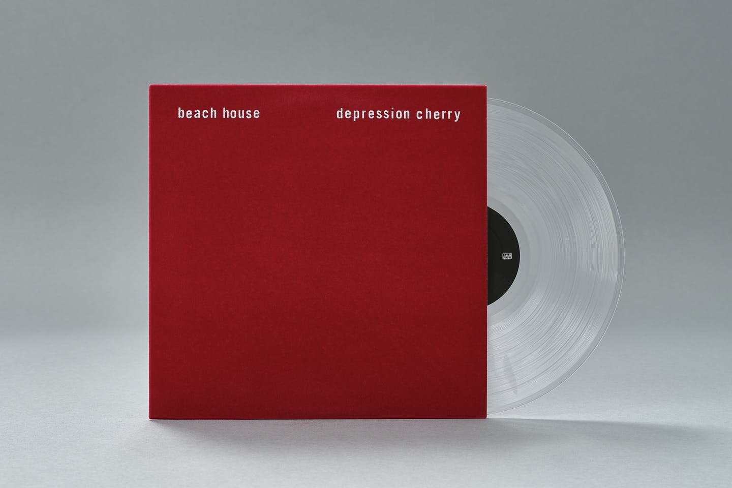
Picture this. The year is 2015. If you are an avid listener of indie music the albums that seem to define this time period include, but are not limited to: Depression Cherry by Beach House, Carrie & Lowell by Sufjan Stevens, Art Angels by Grimes, and Vulnicura by Björk. You are sitting in your car on a hot summer night in July with the radio on full blast. Suddenly you hear a mans voice with a light Australian accent singing a trippy upbeat song, "…she was holding hands with Trevor…” What is this song? Who is Trevor? And why do I want more? The album ’Currents’ is the third studio album of iconic psychedelic indie pop band, Tame Impala. The best way to describe the songs on this critically acclaimed record are transcendental drugs for your ears. (If you would like to listen to the album while reading this post I attached it above, I promise it will give you instant serotonin.)
I could turn this entire blog post into a review of the discography from the genius that is Kevin Parker — the man behind Tame Impala. However, I would like to shift the focus from your ears to your eyes. A metallic sphere being hugged by lines of purple and black, slipping through a lava esc. color gradient. If you have ever looked at the Currents cover artwork you may have thought, ‘who designed this?’ Well that would be Robert Beatty.
Robert Beatty is a 40 year old graphic designer based in Kentucky and the mastermind behind some of the most iconic album art in the industry. Beatty started his career in 2001 as a musician in the noise rock band Hair Police. He later moved onto his solo project Three Legged Race, which is a mixture of avant-garde jazz and electronic music.
When I look at Beatty’s vast body of work I can’t help, but think of how design inherently has an impact on the way we experience music. His distinct style is packed with detail which lets the eye linger for a while and keeps the viewer engaged with his work. You can directly see the impact of surrealist works as well as the more tangible works of Japanese 80’s airbrush works.


While his most notable cover may be the Currents album I am here to share with you his other body of designs that you may recognize. If you love what you see below and want to check out more of his work you can go to his website https://robertbeattyart.com or follow him on Instagram @robertbeattyart. I also made a Spotify playlist with all of his covers linked here!


More of Beatty’s album art (from left to right) Kesha’s Rainbow, William Tyler’s Goes West, Bedouine’s Bird Songs of a Killjoy, Matt Duncan’s Soft Times, The Flaming Lips Oczy Mlody, Drug Dealer’s The End of Comedy, and GUM’s The Underdog.
Citation
https://robertbeattyart.com/Kesha-Rainbow
https://pitchfork.com/news/61806-album-artist-robert-beatty-tame-impala-neon-indian-featured-in-pitchforktvs-pitchfork-unsung/
https://creativemornings.com/talks/robert-beatty

Album Art 101: The Good, The Bad & The Ugly
Close your eyes and think of your all time favorite album. What is the first thing that pops into your head? Do you see the title of your favorite track? A song lyric? The face of your album’s musician? A memory of you listening to the album? Do you associate a specific color with your album? Or maybe you see the album art?
There is no doubt that the visual component of an album can make or break the way people engage with an artists music. Having a strong visually branded album cover that is able to seamlessly capture the essence of a musician and their music is essential. A well thought out album cover utilizes deliberate design decisions and is ultimately able to stand the test of time. Unfortunately, there are musicians in the industry who don’t recognize or prioritize the importance of putting together quality album art. Art is subjective, but these are my opinions on the good, the bad and the ugly of album art. I would like to note that I am aware that rising artists don’t have the same access to renowned graphic designers as famous musicians do. But with websites such as Fiver, it has become even easier find decent designers on a budget.
The Good.
Willo Perron & Associates is a multi-media creative agency, founded by Willo Perron, that is behind most of the artist projects that we know and love to date. Their work ranges from the album cover of 808s and Heartbreaks by Kanye West to St. Vincents Masseduction. Everything that they touch is pure gold. They are inherently “good” because they create innovative pieces of work that directly convey the message of each artist they work with. The Willo Perron team works as a collective which means they have access to feedback and the ability to perfect their work. *Pro tip if you are starting to design album art, don’t be afraid to reach out to your peers and fellow creatives for constructive criticism. Good design is all about having a conducive design mindset, if you aren’t willing to adapt your skill set it will only stunt your growth as a designer. The amount of labor put into the work they put out is evident which is why I believe they reign in the top tier of design houses.


The Bad.
Just because something is bad doesn’t mean necessarily mean it isn’t redeemable. A person that is bad can better themselves and evolve. The same goes with album art. There are plenty of album covers from the 70’s and 80’s that come to mind when I think of bad album art, but I truly think the best example of bad album art has to be any of the Creed album covers. Human Clay is possibly the most horrifying album cover I have ever seen. That being said I think its important to acknowledge the lack of knowledge of 3d rendering in 1999 compared to now. These covers are so awful looking to the point where it makes them intriguing and almost comedic in a way.


The Ugly.
If I could give an award to the epitome of ugly album art it would most definitely go to Soundcloud rappers in a heartbeat. Not to put the Soundcloud rappers in a box because I definitely have seen some okay covers, but most of them have the same look. Nothing says ugly like poor Photoshop skills and a lack of design/ typographic direction. Album art is supposed to reflect the music not the ego of the muscian. These covers tend to be heavily effected and edited which makes it hard to take them seriously. You can clearly tell there is no intention behind the design decisions.


I hope you enjoyed my take on the good, the bad and the ugly of album art! Let me know your favorite or least favorite album art in the comments.

Collector Collecting Collections

We are all familiar with collections on some level. May it be that you are a person who collects snow globes from family vacations as a token of your experience, or a more unhealthy form of collection, hoarding. Those who hoard become so out of touch with reality through their means of collecting. The solace act of collecting is something I consider to be an art form. And I only say this because I was raised by two obsessive collectors.
Throughout my lifetime, my mother’s collection of choice seemed to be picking up hobbies. One day you could find her making jewelry and the next she would be painting quirky designs on leather bags. As time would go on she would get tired of her hobby and pick up a new one. Little collections of hand crafted pieces from each hobby are left dancing around the house. Most recently she has resided her comfort in collecting enamel pins — assembling a stock pile of around 100.
My father could be considered the master collector of the household. There is no limit to what he deems to be a collectors item. His collections are extreme; 400 pairs of sneakers, 150 baseball hats, 230 records, 70 ice cream scoops and 1520 ticket stubs. Each one is a huge part of his personality. You could also say his collections are experience oriented. Especially his ticket sub collection because they represent his saturated love for music.
Our basement storage closet is home to all of our lost collections. Old baseball cards, American Girl Dolls, posters from my fathers college dorm and children books from when my mom was a teacher. I find resonance with this. To me it symbolizes how collections can be synonymous with filling an absence. Collecting memories only to forget them. Collecting shoes to collect dust.
I found myself collecting in a different way. A big part of my childhood was going through the collections that amassed in my family. I would try to form my own collections, but they became easily disorganized piles of nothingness. As I have grown into myself and my design pathway, I have realized that this notion of “the collection” has manifested itself into my career. My head is constantly collecting imagery and archiving it to use as visual information for projects that I am working on. When I look for inspiration I tend to just think about my brain archive and find something cataloged in there. Maybe it’s the logo from my child hood toy store, a random scene from an episode of Arrested Development or a picture of hello kitty I found on Tumblr in 2012. These random modge-podge of things all contribute to the way I create. I think this is also why I love museums so much because they —in theory— are just massive collections of culture and art.
When I look back into my brain archive I always reference back to my dads record and CD collection. As much as I love music, it was never about that, rather the cover. The covers that I would reach for were the ones that I found to be the most visually interesting. Album art is special to me which is why I want to share with my most prized collection of graphic designers that are always in my head. These designers are infamous for their contribution to music through their art and I hope they leave the same impact on you that they have had on me.
