Less is More

Hello everyone, welcome back! For the most part my blog has been centered around album covers that could be considered highly decorative or design oriented. However, this week I want to talk about the power of simplicity with album art. The phrase “less is more” is used to express the view that a minimalist approach to artistic or aesthetic matters is more effective. So what does minimalist album art look like? Let’s take a look.
All album art starts off as blank canvas and I think there is something to be said about choosing to leave a cover empty. We can compare this to fine art pieces such as Robert Rauchenberg’s Three Pannel White Painting or the works of color-field painter, Mark Rothko. In fact Rothko is quoted with saying, “there is more power in telling little than in telling all.” Emphasis on the less is more mindset. The absence of substance let’s the viewer be enveloped in the work. The same thing can be applied to album art.
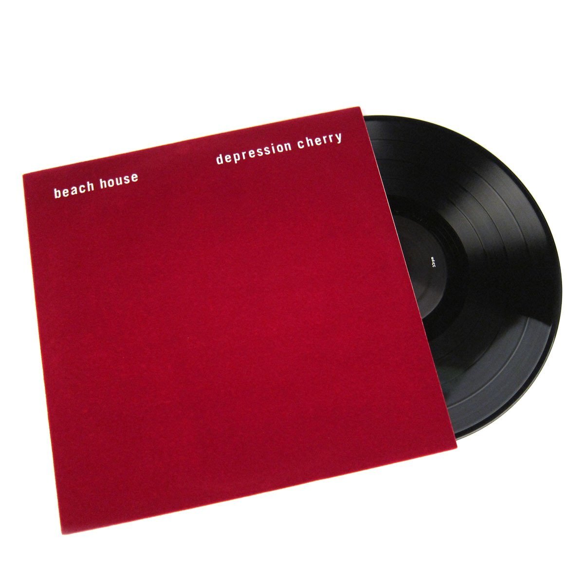
Some of the most iconic album covers Kendrick Lamar, Beach House, Beach Fossils Beatles White Album. Using a solid cover on a cover These solid covered album covers portray the mood of the album with a solid color or no color at all.


Californian artist Rutherford Chang displayed his staggering collection of 693 discrete second hand copies of The Beatles’ self-titled 1968 LP, more commonly known as The White Album, at New York’s Recess Gallery.
As Chang told the New York Times in February of this year: “Being an all-white cover, the changes are apparent. The serial numbers made collecting them seem natural, and the more I got, the more interesting it became. As you see, many of them are written on, and each has a story. The accumulation of the stories is part of it.”


Citations:
https://thevinylfactory.com/news/artist-layers-100-unique-copies-of-the-beatles-white-album-for-original-vinyl-release/